10 Reasons Church Website Designs are Terrible
Church websites can often be the butt of jokes among designers, marketers, and other people who deem themselves “hip” to website design. Unfortunately, most of the time they are right. Many church website designs really are as terrible as most designers believe.
But obviously, this does not have to be the case. So why do so many church website designs fall flat? Why are bad church websites such a fact of life? Perhaps the underlying reason is an unwillingness to invest in good web design. Maybe it’s because good web design is not really a priority for most churches.
Whatever the underlying motives, here are 10 specific reasons church web design often falls flat.
Everything feels impersonal
Your site can be so much more than just a glorified bulletin board. Creating personal connections matters, not just for churches but for every business and other enterprises as well. You want both regular and potential members to feel a connection with your church when they look up your site. This way, your message has a better chance of making a bigger impact.
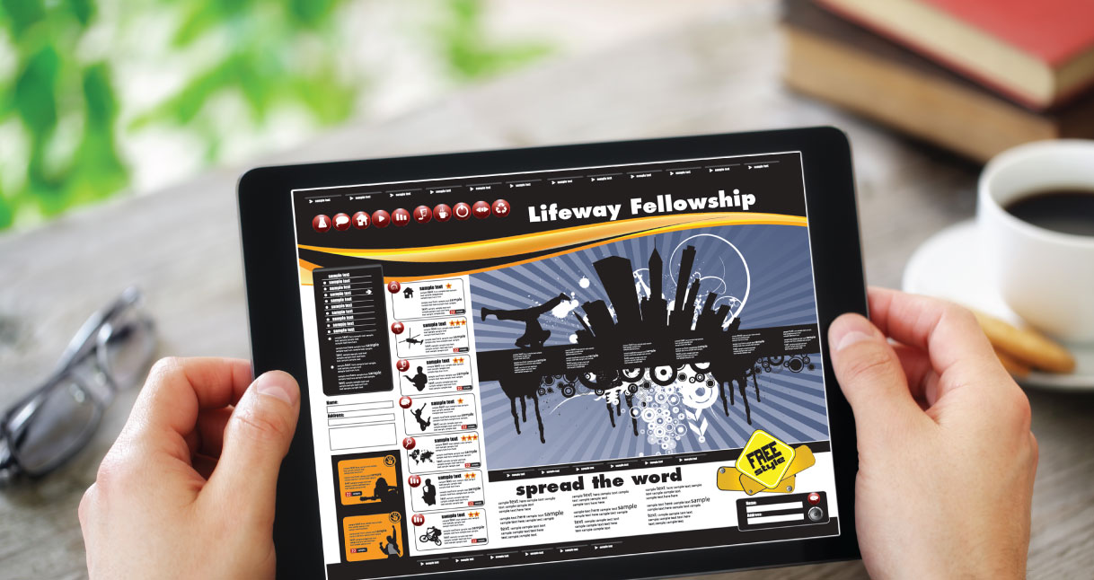
Inappropriate layouts and fonts

Too often we’ve seen churches ruin an otherwise beautiful message with fonts that dilute it. Comic Sans and Papyrus are some of the most common offenders, lending an inappropriately childish feel to many websites. Even worse are illogical layouts that don’t seem to have been tested with real users. But these are such common mistakes that a lot of us have stopped seeing them. Even the Vatican, with a history of centuries of great art and design has made these mistakes in the past.
Bad photos
It’s a given that photos on your site need to be of a decent quality and should load reasonably fast. But church website photos should also feel like they belong and serve a specific purpose. Many church websites don’t always consider these things. Do you want the church to look fun or inclusive? The pictures you include on the site should support those ideas.
Boring or uninviting content
Contrary to what some designers believe, the actual content is in fact, an important part of church website marketing. The rest of the site is mostly a vehicle to deliver content, but taking some time to plan out what exactly is said in posts, images, and videos can make for a more powerful message and make everything everything else that much simpler.
As we discussed in an earlier post, content should follow the basic principles of good storytelling. It would be a waste to write at length or produce a video about a rather important topic, only to have your readers drop out before you’ve even made your point. Image and video content should also show church members in a happy light, not bored or nonplussed as seems to be the case in many church websites.
Difficult to navigate

Having good content will be moot if your website’s users are unable to easily find the information they need. Make sure your site stays within the best current practices of site layout so that your visitors are never lost.
Outdated information
Have you moved? Has the exterior of the church changed significantly in appearance? Did the service schedules change? Are pastors and key staff the same as when you created the site five years ago? Are the donation instructions up-to-date? Does the info on your page match that on your flyers and brochures?
90’s design
You seriously do not want a text or image marquee on your site today, nor do you want glitter graphics or animated GIFs on the background. Drop shadows, embossing, HTML frames, and visitor counters are just some of the things that you will want to avoid, not just because they look dated, but also because they may not display correctly on today’s mobile devices.
That brings us to my next point…
Not responsive on mobile

If you haven’t updated your church website designs in a while, it’s worth checking to see if your site displays correctly on mobile devices. If you haven’t updated since 2010 — a situation more common than you might expect — it’s essential to either update, or totally overhaul your site to ensure it fits with how people use the internet today.
No maps
It’s incredible how many church websites fail to include maps to where the church is actually located. It’s fairly simple even for novice site developers to generate a Google Maps embed code, or add the Google Maps Geocoding API. It will also help to supplement the map with updated pictures of the exterior of your church or any relevant event site.
No defined purpose

Do you want to increase church attendance? Attract new members? Increase stewardship? Highlight some historical aspect of your church? Every single website and every page should have a specific goal, and whatever you put up should have a purpose behind it.
Of the many reasons church websites are terrible, the lack of a unifying purpose might be the biggest reason so many church websites can be a chore to use. Any of the other previous reasons are forgivable, and frankly, quite survivable. Your webpage will often do just fine with a less-than-optimal layout or corny pictures. On the other hand, the lack of a clear purpose will doom a website every single time.
Churches must get out of the mindset of putting up a website “just because;” otherwise the time, effort, and money involved in creating that site will be for nothing.
Marketing for churches, whether through online or offline means, does not have to content itself with being mediocre. Putting forethought into what potential members are looking for, as well as what current members will be looking for on your website, will make your website worth the investment.
Faith-Based Segment Manager