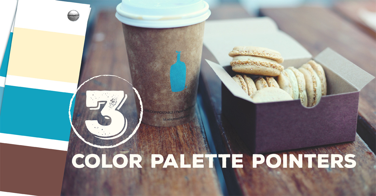
3 Color Palette Pointers for Effective Brochure Design
Brochures are an important part of any marketing campaign. When combined with other marketing tools such as social media and other print products, brochures can be highly effective. This is especially true when they are given to prospects that have already signaled interest in your product or service. Effective brochure design can help reduce waste, increase conversion rates, and give you an overall better return on your marketing investment.
One important element of effective brochure design is the color palette. This factor can determine whether or not your campaign succeeds or fails.
Effective Color Combinations

There are three key aspects to effective color combinations:
- Sticking to a motif. An overall color motif isn’t just for aesthetic purposes. Given the right shades of the right colors, the motif can directly communicate a brochure’s message. The colors and hues in a brochure can either make a person read on or lose interest.
- Contrasting low value and high value colors. A rule of thumb is to avoid low value colors (most of the lighter colors) and use high value colors (most of the darker colors). Combining two dark colors though, is just as detrimental as combining two light colors. An example of this problem is setting yellow text on a white background. Contrast low and high values or vice versa.
- Limiting the number of colors used. Using all seven colors of the rainbow is effective only where appropriate. The effect colors have on interest can overwhelm if there are too many colors in a single setting.
Effective color combinations make for effective brochure design. And remember, even the color of the text in the brochure needs to be factored in.
Colors for Effective Brochure Design

Colors evoke many interesting emotions and notions from people, so using the right colors to create the right impact is essential. The colors used on a brochure depend on the business or message, but there are standard pointers that should always be kept in mind. One of the more important reminders is to always maintain readability.
You can do so by:
- Contrasting text colors to background colors.
- Using colors that contrast or match with the season (summer colors during summer, winter hues during winter, or vice versa).
- Using complementary multi-color designs (when not using single-color designs).
These are among the more practical points, but there are many that promote readability.
Value-Adding Nuances or Annoying Nuisances?

It might be tempting to add nuances of bright color or elaborate drop shadows, but never sacrifice a brochure’s reader-friendliness in doing so. Accentuate where elements add value to the brochure, but always think if accents and niceties only serve to distract, or worse, annoy readers. This is actually a point that promotes readability, but it merits a separate mention.
Follow these color palette pointers to design your brochure with the reader in mind, and you will come up with more effective brochures.
What other guidelines can you think of? Comment below.

PrintPlace’s mission is to provide customers with unparalleled printing services through the knowledge and expertise of its employees.


