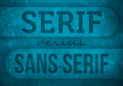
Serif vs sans serif fonts
When should you use serif vs san serif? There are correct places to use serif fonts and others for san serif fonts. Today’s Graphic Design Friday video discusses the benefits of each, and when you should use them.
We have a new graphic designer in our tips video this week. Her name is Sharon. You may remember her from when we introduced the PrintPlace.com art department. She was the one with the amazing opera solo at the end. If you haven’t seen it, here is “The People Behind PrintPlace.com: Art Department Edition.”
Back to today though, Sharon has font tips that focus on serif versus sans serif fonts. You may already know the difference, but do you know when you should use them?
Sans serif fonts have become popular recently, but carry a certain perception with them as well. Here is our video to help you sort through it.
We will be back next Friday too, with more tips from PrintPlace.com!
Video Transcription
Hi there! My name is Sharon and I’m a graphic designer for Print Place.com.
Fonts are the foundation of any good design. Choosing the wrong font can make a piece unreadable and potentially push your audience away.
Two of the most basic font families are serif and sans serif. Serif refers to the small strokes attached to the top or bottom of typefaces. Sans is French for ‘without,’ so Sans Serif fonts don’t contain these extra strokes.
Serif fonts are often considered to be a more classic or antique style typeface. Sans serif invokes a more modern or clean style.
So when should you use serif versus sans serif fonts?
Generally, serif is best for printed material that has extensive blocks of information. The serifs make each letter distinctive and easier to read quickly.
Sans serif works better for web applications. Computer monitors are much lower resolution than print and can cause the fine detail of serif fonts to run together in body copy.
So… serif is best for print. Sans serif does better for web.
However, there are a few exceptions. Sans serif fonts make great bold headlines for print. Alternatively, serif can be used as headlines on the web and remain legible.
That’s it for this week! Come back every Friday for more tips on graphic design from PrintPlace.com. Don’t forget to subscribe!
PrintPlace’s mission is to provide customers with unparalleled printing services through the knowledge and expertise of its employees.